Bhasha: Sanskrit Transliteration

Typing Sanskrit can be challenging if you don’t have access to your special keyboard, or don’t have your favorite input tools installed on the computer you are working on.

So I set out to write a Google Docs add-on that could make it easy to do so. A Google Docs add-on could be an ideal option for typing Sanskrit, even while using guest computers.

Sanskrit has more sounds than English and other languages written in Roman scripts. Devanagari is the commonly used script used for writing Sanskrit and uses non-ASCII characters. Some systems such as IAST and ITRANS use additional symbols to represent Sanskrit sounds in Roman-like scripts. For example, ā in IAST is used to represent the long “a” syllable.

I found this library called Sanscript.js which could convert between these different writing schemes. However it doesn’t address the problem of being able to use a standard keyboard with ASCII characters. IAST includes additional characters such as ū, ṣ, ñ, ṅ, ṃ, etc. It is more readable than other competing schemes such as ITRANS. ITRANS includes a mix of upper-case and lower-case letters, in the middle of a word, to represent additional sounds. This has adverse affect on the aesthetics of the script. I find it harder to read as well. IAST has also been used in academia and Sanskrit books written in the West since a long time. As a result many users of Sanskrit language are familiar with this system. It was later standardized as ISO 15919 with small changes.

I added a new “IAST Simplified” scheme to the list supported by Sanscript.js. This is inspired from my favorite Sanskrit writing software called Sanskrit Writer. This scheme uses standard ASCII characters and closely resembles the IAST scheme. For example, it uses a for ā, ~n for ñ, and h. for , and so on. The following table explains this scheme in detail:

Vowels

a

-a

i

-i

u

-u

r.

-r.

l.

-l.

e

ai

o

au

m.

h.

Consonants

ka

kha

ga

gha

.na

ca

cha

ja

jha

~na

t.a

t.ha

d.a

d.ha

n.a

ta

tha

da

dha

na

pa

pha

ba

bha

ma

‘sa

s.a

sa

ha

 ळ

_la

ya

ra

la

va

Vowel Marks

क्

k

खा

kh-a

गि

gi

घी

dh-i

ङु

.nu

चू

c-u

छृ

chr.

जॄ

j-r.

झॢ

jhl.

ञॣ

~n-l.

टे

t.e

ठै

t.hai

डो

d.o

डौ

d.au

tha

णं

n.am

तः

tah.

क्ष

ks.a

त्र

tra

ज्ञ

j~na

Symbols

.

।।

..

0

1

2

3

4

5

6

7

8

9

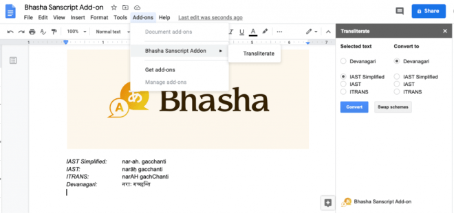
After these additions to Sanscript.js, I was able to write a quick Google Docs plugin that could convert between different schemes with a click of a button. You can try this plugin out by visiting this link, or searching for “Bhasha” in Google Docs under addons.

I was hoping to have a WYSIWYG design where transliteration could happen as you typed. This required intercepting each edit, and was not possible using the Google Docs API. As a second option, I wrote a plugin for QuillJS, a cool open-source rich-text editor. You can try out this add-on here: https://trivedigaurav.com/exp/bhasha/.

Screenshot of the QuillJs editor with Bhasha plugin.

This may not be mobile friendly. I didn’t spend time test it on the phone since you can easily switch to a Sanskrit keyboard on a phone anyway.

Source code for the QuillJS plugin is on Github here. Please feel free to hack on it!

Edit 1: Bhasha is now available as a Google Docs add-on.

Edit 2: Added Vedic accents!

IAST: a॒gnimī॑ḻe pu॒rohi॑taṃ ya॑jñasya॑ de॒vamṛ॒tvija॑m
Devanagari: अ॒ग्निमी॑ळे पु॒रोहि॑तं य॑ज्ञस्य॑ दे॒वमृ॒त्विज॑म्
IAST Simplified: a\_gnim-i\!~le pu\_rohi\!tam. ya\!j~nasya\! de\_vamr.\_tvija\!m

Edit 3: Added Double Tone Svarita!

Devanagari: स्थि॒रैरङ्गै᳚स्तुष्टुवाग्ँस॑स्त॒नूभिः॑
IAST Simplified: sthi\_raira.ngai\=stus.t.uv-ag~csa\!sta\_n-ubhih.\!

DermaQ Treatment Assistant

I participated in BlueHack this weekend – a hackathon hosted by IBM and AmerisourceBergen. I got a chance to work with an amazing team (Xiaoxiao, Charmgil, Hedy, Siyang and Michael) —  the best kind of team-members you could find at a hackathon. We were mentored by veterans like Nick Adkins (the leader of the PinkSocks tribe!), whose extensive experience was super-handy during the ideation stage of our project.

Our first team-member, Xiaoxiao Li, is a Dermatology resident who came to the hackathon with ideas for a dermatology treatment app. She explained how most dermatology patients come from a younger age-group and are technologically savvy enough to be targeted with app-based treatment plans. We bounced some initial ideas with the team and narrowed down on a treatment companion app for the hackathon.

We picked ‘acne’ as an initial problem to focus on. We were surprised by the billions of dollars that are spent on acne treatments every year. We researched the main problem in failed treatments to be patient non-compliance. This happens when the patients don’t understand the treatment instructions completely, are worried about prescription side-effects, or are just too busy and miss doses. Michael James designed super cool mockups to address these issues:

While schedules and reminders could keep the patients on track, we still needed a solution to answer patients’ questions after they have left the doctor’s office. A chat-based interface offered a feasible solution to transform lengthy home-going instructions into something usable, convenient and accessible. It would save calls to the doctor for simpler questions, while also ensuring that patients clearly understand doctor’s instructions. Since this hackathon was hosted by IBM, we thought that it would be prudent to demo a Watson-powered chatbot. Charmgil Hong and I worked on building live demos. Using a fairly shallow dialogue tree, we were able to build a usable demo during the hackathon. A simple extension to this would be an Alexa-like conversational interface, which can be adopted for patient-education in many other scenarios such as post-surgery instructions etc.:

Demo of our conversational interface built using Watson Assistant

Hedy Chen and Siyang Hu developed a neat business plan to go along as well. We would charge a commitment fee from the patients to use our app. If the patients follow all the steps and instructions for the treatment, we return a 100% of their money back. Otherwise, we make money from targeted skin-care advertisements. I believe that such a model could be useful for building other patient compliance apps as well. Here‘s a link to our slides, if you are interested. Overall, I am super happy with all that we could achieve within just one and a half days! And yes, we did get a third prize for this project 🙂 

Machines learn to play Tabla, Part – 2

This is a followup on my earlier post on Machines Learn to play Tabla. You may wish it check it out first reading this one…

Three years ago, I published a post on using recurrent neural networks to generate tabla rhythms. Sampling music from machine learned models was not in vogue then. My post received a lot of attention on the web and became very popular. The project had been a proof-of-concept and I have wanted build on it for a long time now.

This weekend, I worked on making it more interactive and I am excited to share these updates with you. Previously, I was using a proprietary software to convert tabla notation to sound. That made it hard to experiment with sampled rhythms and I could share only a handful sounds. Taking inspiration from our friends at Vishwamohini, I am now able to convert bols into rhythm on the fly using MIDI.js.

Let me show off the new javascript synthesizer using a popular Delhi kaida. Hit the ‘play’ button to listen:

Now that you’ve heard the computer play, here’s an example of it being played by a tabla maestro:

Of course, the synthesized outcome is not much of a comparison to the performance by the maestro, but it is not too bad either…

Now to the more exciting part- Since our browsers have learned to play the tabla, we can throw in the char-rnn model that I built in the earlier post.  To do this, I used the RecurrentJS library and combined it with my javascript tabla player:

Feel free to play around with tempo and maximum character-limit for sampling. When you click on ‘generate’,  it will play a new rhythm every time. Hope you’ll enjoy playing with it as much as I did!

The player has a few kinks at this point I am working towards fixing them. You too can contribute to my repository on GitHub.

There are two areas that need major work:

Data: The models that I trained for my earlier post was done using a small amount of training data. I have been on a lookout for better dataset since then. I wrote a few emails, but without much success till now. I am interested in knowing about more datasets I could train my models on.

Modeling: Our model did a very good job of understanding the structure of TaalMala notations. Although character level recurrent neural networks work well, it is still based on very shallow understanding of the rhythmic structures. I have not come across any good approaches for generating true rhythms yet:

I think more data samples covering a range of rhythmic structures would only partially address this problem. Simple rule based approaches seem to outperform machine learned models with very little effort. Vishwamohini.com has some very good rule-based variation generators that you could check out.  They sound better than the ones created by our AI. After all the word for compositions- bandish, literally derived from ‘rules’ in Hindi. But on the other hand, there are only so many handcrafted rules that you can come up with which may lead to generating repetitive sounds.

Contact me if you have some ideas and if you’d like to help out! Hope that I am able to post an update on this sooner than three years this time 😀

Announcing NLPReViz…

Update – 5 Nov’18: Our paper was featured in AMIA 2018 Fall Symposium’s Year-in-Review!

NLPReViz - http://nlpreviz.github.io

We have released the source code for our NLPReViz project. Head to http://nlpreviz.github.io to checkout its project page.

Also, here’s our new JAMIA publication on it:

Gaurav Trivedi, Phuong Pham, Wendy W Chapman, Rebecca Hwa, Janyce Wiebe, Harry Hochheiser; NLPReViz: an interactive tool for natural language processing on clinical text. Journal of American Medical Informatics Association. 2017. DOI: 10.1093/jamia/ocx070.

Increasing Patient-Provider Interaction with “Pharma-C”

This weekend I took part in The Pitt Challenge Hackathon hosted by the School of Pharmacy and the Clinical and Translational Science Institute. I found this hackathon interesting because it had specific goals and challenged the participants to “Change the way the world looks at Health.” I went to the event with absolutely no prior ideas about what to build. I enjoy participating in hackathons for a chance to work with a completely new group of team members every time. I joined a team of two software professionals Zee and Greg right after registration. We were then joined by a business major – Shoueb during the official team formation stage of the event. The hackathon organizers provided us with ample opportunities to have discussions with researchers, professors and practitioners about the problems they’d like to solve with technology.

We started with a lot of interesting ideas and everyone in the team had a lot to contribute. We realized that almost all of our ideas revolved around the concept of increasing the interaction between the patient and providers outside of the health care setting. Currently, the patients have little interaction with the health care providers apart from the short face-to-face meetings and sporadic phone calls. Providers are interested in knowing more about their patients during their normal activities. Patients would also feel better cared for when the providers are more vested in them. We began with a grand scheme of creating a three-way communication channel with patient, physicians and pharmacists. After having more discussions with the mentors, we soon understood our big challenges – ‘busy schedules’ and ‘incumbent systems.’ We decided to focus on patient-pharmacy interactions. We brainstormed ideas about how we can build a system that ties well with the existing systems and isn’t too demanding in terms of time, either from the pharmacists or the patients. We decided to call ourselves – “Pharma-Cand after appropriate amount of giggling over the name, we sat down to think about the tech.

We wanted to design a system that could be less intrusive than phone calls, where both participants must be available at the same time, but also more visible than emails that could be left ignored in the promotions inbox. We began with an idea of using an email based system that could also appear as Google Now Cards as notifications on phones and smart devices. To our disappointment, we learned that Google Now only supports schemas for a limited number of activities (such as restaurant reservations, flights etc.). As a result, we moved on to a custom notification service. We agreed upon using the Pushover app which made it very easy to build a prototype for the hackathon.

We built a web-based system that could be connected to the existing loyalty programs from the pharmacies. The patients could opt for signing up for additional follow-up questions about their prescriptions. These questions could be generic ones such as: How many prescribed doses have you missed this week?, Is your prescribed medicine affordable?, Do you have questions about your current prescription?; or specific follow-up questions about the drugs they are taking. One could be interested in knowing how the patients are doing, whether the drug is having the desired effects or even reminding them about the common side-effects. Once signed up, a weekly script could send notifications to the participants and collect their responses from their preferred devices. Having such a system in place would help the pharmacists gather better information about the patients and offer interventions. They could look at the summary information screen when they make their follow-up calls according the existing systems in place. We believe the such a system could benefit both the pharmacies and the users without disrupting their regular workflows.

During the course of 24 hours, we finished building a working prototype and could demo everything in real-time to all our judges. One addition that improve the challenge would be to release some datasets for the participants to work with. We wanted to try some interesting data analysis methods for our problems but were limited to work on data collection hacks. Overall, I enjoyed taking part in the Pitt Challenge Hackathon and will look forward to their future events.

On Clippy and building software assistants

I have been attending a reading group on visualization tools for the last few weeks. This is a unique multi-institution group that meets over web-conferencing at 4 PM EST / 1 PM PST on Fridays. It includes a diverse bunch of participants including non-academic researchers.

Every week we vote on and discuss a range of topics related to building tools for visualizing data.

This week, it was my turn to lead a discussion on the Lumiere paper. This is the research responsible for the now retired Clippy Office assistant. I also noticed a strong ISP presence in the references section as the paper focuses on Bayesian user modeling.

During the discussion, we talked about how we can offer help to use vis tools better. Here are my slides from it:


References

  1. Eric Horvitz, Jack Breese, David Heckerman, David Hovel, and Koos Rommelse. 1998. The lumière project: Bayesian user modeling for inferring the goals and needs of software users. In Proceedings of the Fourteenth conference on Uncertainty in artificial intelligence (UAI’98), Gregory F. Cooper and Serafín Moral (Eds.). Morgan Kaufmann Publishers Inc., San Francisco, CA, USA, 256-265.
  2. Justin Matejka, Wei Li, Tovi Grossman, and George Fitzmaurice. 2009. CommunityCommands: command recommendations for software applications. In Proceedings of the 22nd annual ACM symposium on User interface software and technology. ACM, New York, NY, USA, 193-202.